
Pie charts are a popular and widely used tool for data visualization. They are often employed to represent data in a visually appealing and easy-to-understand manner. Pie charts are particularly useful when presenting data that is broken down into categories or percentages, as they allow us to quickly and easily compare the relative sizes of each category. However, not all data is well-suited to this type of chart, and there are certain situations in which a pie chart may not be the best choice.
The effectiveness of a pie chart depends largely on the nature of the data being presented. When data is divided into a small number of categories, each category is clearly defined, and there is a significant difference in size between the categories, a pie chart can be a very effective way to represent the data. It can provide a clear and concise representation of the data, making it easy for viewers to quickly understand the information being presented. However, in cases where there are many categories, or where the categories are not clearly defined, a pie chart can become confusing and difficult to read.
When Would a Pie Chart Be an Effective Visualization?
A pie chart is a type of graphical representation that displays data as a series of slices, with each slice representing a proportion of the whole. Pie charts can be used to visualize a variety of data, such as population breakdowns, financial figures, or survey results. But when would a pie chart be an effective visualization?
Advantages of Pie Charts
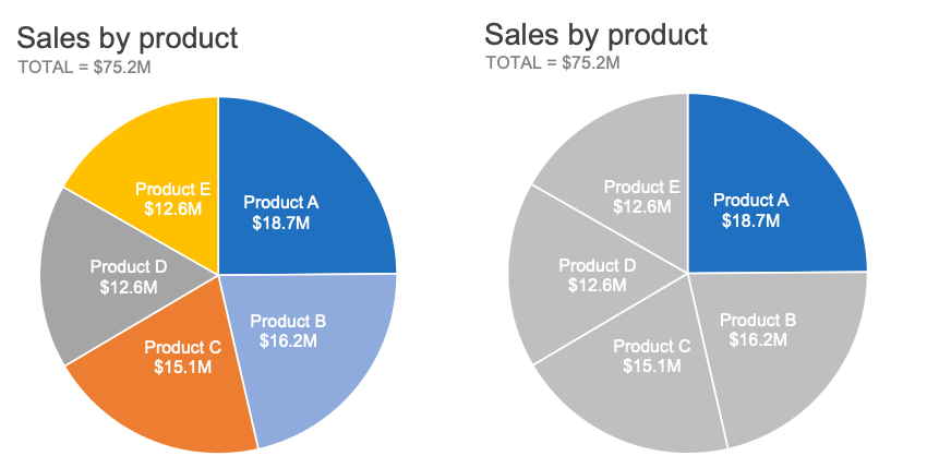
Pie charts offer several advantages. First, they can be used to quickly compare the relative sizes of different data points. For example, a pie chart can be used to compare the market share of different companies or the proportion of different types of customers. Second, they can be used to show relationships between different data points. Third, they can be used to show the parts of a whole.
Pie charts also have a few drawbacks. First, they can be difficult to read if there are too many slices. Second, the slices can be hard to distinguish from one another if the colors are too similar. Third, it can be difficult to compare data points if the sizes of the slices are too small.
When Pie Charts Are Effective
Pie charts are most effective when data points can be easily compared and contrasted. For example, a pie chart can be used to compare the market share of different companies or the proportion of different types of customers. This is because the relative sizes of the slices make it easy to compare the data points.
Pie charts are also effective when the data points can be easily distinguished from one another. For example, a pie chart can be used to compare the proportion of different colors in a color wheel. This is because the colors can easily be distinguished from one another.
Pie charts are also effective when the data points represent a whole. For example, a pie chart can be used to show the proportion of a budget that is allocated to different areas. This is because the total area of the pie chart represents the total budget.
Frequently Asked Questions
Pie charts are graphical representations of data, used to easily compare proportions of different categories of data. They are effective when used correctly.
When is a Pie Chart an Effective Visualization?
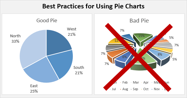
A pie chart can be an effective visualization when used to compare the proportions of different data categories. It is best used to compare no more than 7-8 categories of data, and it is important to ensure that the categories can be broken down into easily distinguishable proportions. The proportions should also be relatively similar, as large differences can make the pie chart difficult to read. Additionally, pie charts are effective when used to show the overall size of each category relative to the others.
What Factors Should be Considered When Choosing a Pie Chart?
When deciding whether to use a pie chart, you should consider the number of data categories you are comparing, the size of the differences between the categories, and the type of data you are trying to represent. You should also consider how you want to emphasize the relationships between the categories, as pie charts are better suited for emphasizing the overall sizes of categories rather than the relationships between them.
Are There Alternatives to Pie Charts?
If a pie chart is not the most effective visualization for the data you are working with, there are other options available. Bar graphs and line graphs are both good alternatives when you are looking to compare the values of multiple categories, as they can more accurately represent the differences between categories. Additionally, if you are looking to emphasize relationships between categories, a scatter plot may be a better choice.
What are the Advantages of Using a Pie Chart?
One of the main advantages of using a pie chart is that it can be used to quickly and easily compare the proportions of different data categories. Pie charts can also be used to show the overall size of each category relative to the others. Additionally, pie charts can be used to represent data visually in a way that is easy for people to understand.
What are the Disadvantages of Using a Pie Chart?
One of the main disadvantages of using a pie chart is that it can be difficult to accurately represent the differences between categories of data if the proportions are not similar. Additionally, pie charts are not well-suited for representing relationships between categories, as this can make them difficult to read. Finally, pie charts can be difficult to interpret if there are more than 7-8 categories of data, as it can be hard to accurately compare the proportions.
Think Before You Pie Chart: Visualizing Data More Effectively
In conclusion, pie charts can be an effective visualization tool when presenting data that is easily understandable and can be broken down into clear categories. They are especially useful when presenting data to a non-technical audience or when trying to convey a general overview of a larger dataset. Pie charts also provide a quick and easy way to compare the relative sizes of different categories and can be used to highlight specific trends or patterns. However, it is important to note that pie charts are not always the best choice for presenting complex data or when trying to accurately represent proportions.
Despite their limitations, pie charts remain a popular choice for data visualization due to their simplicity and ease of use. As with any data visualization tool, it is important to carefully consider the purpose and audience of your presentation before deciding whether or not to use a pie chart. By keeping these factors in mind, you can ensure that your data is presented in a clear and effective manner that engages and informs your audience.