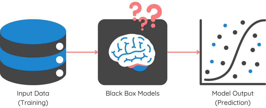
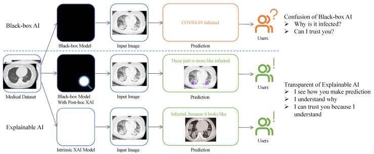
Explainable Artificial Intelligence (XAI) lives up to its name by providing tools and methods to explain the decision-making processes of intelligent systems. Artificial Intelligence is ubiquitous in today’s digital landscape, with AI models being utilized across various domains, from simple regression-based forecasting models to complex object detection algorithms in deep learning.
For instance, consider a hospital using a tumor detection CNN model to analyze patient X-rays. However, how can a technician or patient trust the results if they don’t understand how the model works? This is where the need for methods to comprehend the decision-making process of deep learning models becomes imperative.
This blog explores the significance of AI explainability, the current methods available, and their practical applications.
Why is Explainable AI (XAI) Necessary?
The complexity of machine learning models has significantly increased, from linear regression to multi-layered neural networks, CNNs, transformers, and more. While these models have enhanced predictive capabilities, they are essentially black-box models.

The intricate architecture and mathematical computations underlying these models are too complex for data scientists to decipher. As a result, we require specialized tools to interpret and comprehend them. Here are the main reasons behind the need for XAI:
- User Understanding and Trust: Explainable AI enhances transparency in decision-making processes, thereby increasing end-user trust and adoption.
- Compliance and Regulations: Companies utilizing AI for marketing recommendations, financial decisions, etc., must adhere to regulations set by the countries they operate in. XAI helps demonstrate compliance with regulations like GDPR by ensuring the exclusion of PII in AI models.
- Identify & Remove Bias: While AI models are adept at mathematical precision, they may exhibit biases in predictions. XAI tools can reveal the factors influencing each prediction, aiding in the identification and elimination of model biases.
- Continuous Improvement: Data scientists often face challenges post-model deployment, such as performance degradation and data drift. Understanding the inner workings of models through XAI equips data teams to enhance and maintain model performance effectively.
- Error Detection and Debugging: Debugging complex models with millions of parameters is a significant challenge for ML engineers. XAI facilitates the identification of specific issues and errors within the system’s logic or training data.
Methodologies of Explainable AI (XAI)
Explainable AI offers a range of tools and processes to explain different aspects of both simple and complex ML models. Before delving into the various methods, it’s essential to understand that ML models can be explained at two levels: Global and Local.
What are Global and Local Explanations?
Global Explanations: At a global level, XAI aims to elucidate the model’s behavior across the entire dataset, providing insights into the primary factors influencing the model and overall trends. This is particularly useful for explaining model functionality to business stakeholders.
For instance, in risk modeling for personal loans, global explanations can reveal key factors driving credit risk across the portfolio, aiding in regulatory compliance.
Local Explanations: On the other hand, XAI at a local level offers insights into the rationale behind a specific decision for a particular input. Local explanations are crucial for understanding individual predictions and identifying biases within the model.
Local explanations play a vital role in pinpointing existing biases within the model. Now, let’s explore some prominent methods:
SHAP
SHAP, or Shapley Additive Explanations, is one of the most widely used methods in Explainable AI due to its versatility. It provides both local and global level explanations, simplifying the interpretability of models. Let’s illustrate how SHAP values work with a practical example using the diabetes dataset:
# Import necessary packages
import numpy as np
import pandas as pd
from sklearn.model_selection import train_test_split
from xgboost import XGBClassifier
df = pd.read_csv(‘../input/pima-indians-diabetes-database/diabetes.csv’)
df.head()

As shown in the dataset, features like glucose level, blood pressure, etc., are present, with the target being ‘Outcome’. A simple XGBoost model is trained on this data to make predictions:
# Define features and target
X = df.iloc[:, :-1]
y = df.iloc[:, -1]
# Split the dataset into 75% for training and 25% for testing
X_train, X_test, y_train, y_test = train_test_split(X, y, test_size=0.25, random_state=0)
model = XGBClassifier(random_state=42)
model.fit(X_train, y_train)
score = model.score(X_test, y_test)
Once the model is trained, SHAP values can be computed for each prediction using the TreeExplainer function:
# Load the model into the TreeExplainer function of shap
import shap
explainer = shap.TreeExplainer(model)
shap_values = explainer.shap_values(X)
A force plot for a single prediction on the test data can be generated using the following code:
# Import necessary packages
import numpy as np
import pandas as pd
from sklearn.model_selection import train_test_split
from xgboost import XGBClassifier
# Define features and target
X = df.iloc[:, :-1]
y = df.iloc[:, -1]
# Split the dataset into 75% for training and 25% for testing
X_train, X_test, y_train, y_test = train_test_split(X, y, test_size=0.25, random_state=0)
model = XGBClassifier(random_state=42)
model.fit(X_train, y_train)
score = model.score(X_test, y_test)
The SHAP values for a single prediction can be visualized through a force plot:
# Load the model into the TreeExplainer function of shap
import shap
explainer = shap.TreeExplainer(model)
shap_values = explainer.shap_values(X)
You can now visualize the impact of each feature at a global level using the summary plot function from the SHAP package:
# Load the model into the TreeExplainer function of shap
import shap
explainer = shap.TreeExplainer(model)
shap_values = explainer.shap_values(X)
A summary plot showcasing the impact of features at a global level can be generated using the code:
# Load the model into the TreeExplainer function of shap
import shap
explainer = shap.TreeExplainer(model)
shap_values = explainer.shap_values(X)
Partial Dependence Plots
Partial Dependence Plots offer a simple method to understand how different features interact with one another and the target variable. By observing the impact of changing a single feature while keeping others constant, insights into critical regions of feature values can be gained.
The Python PDPbox package provides functions to visualize these plots. Let’s explore how to plot partial dependence plots for a single feature in the diabetes prediction dataset:
# Define feature names
feature_names = [‘Pregnancies’, ‘Glucose’, ‘BloodPressure’, ‘SkinThickness’, ‘Insulin’, ‘BMI’, ‘DiabetesPedigreeFunction’, ‘Age’]
# Import module
from pdpbox import pdp, get_dataset, info_plots
# Plot PDP for a single feature
pdp_goals = pdp.pdp_isolate(model=model, dataset=X_test, model_features=feature_names, feature=”Glucose”)
pdp.pdp_plot(pdp_goals, ‘Glucose’)
plt.show()
Interpreting the Partial Dependence Plot of ‘Glucose’ reveals the variation in the target variable for different values of glucose. For instance, when the glucose value ranges between 125 and 175, the impact on the target variable increases significantly.
Similarly, examining the PDP of BMI shows that the target remains relatively constant when BMI is below 100, with a linear increase observed thereafter.
Furthermore, the interaction between two features can be visualized through PDP. For example, plotting the interaction between Age and BMI:
# Use the pdp_interact() function
interaction = pdp.pdp_interact(model=model, dataset=X_test, model_features=feature_names, features=[‘Age’,’BMI’])
# Plot the graph
pdp.pdp_interact_plot(pdp_interact_out=interaction, feature_names=[‘Age’,’BMI’], plot_type=”contour”, plot_pdp=True)
plt.show()
Observe the changing colors as you move along the X-axis (Age) and Y-axis (BMI), indicating the interaction between the two features. This visualization highlights the varying impact of BMI based on different age groups.
Permutation Feature Importance
Permutation Feature Importance is a straightforward method for determining the importance and ranking of features in non-linear black box models. By randomly shuffling feature values and assessing the impact on model performance, significant features can be identified. This method is beneficial for handling outliers and noise in datasets but may incur high computation costs for large datasets.
Using the ELI5 library, the Permutation Feature Importance can be computed for the diabetes dataset:
# Import the package and module
import eli5from eli5.sklearn import PermutationImportance
# Pass the model and test dataset
my_set = PermutationImportance(model, random_state=34).fit(X_test,y_test)eli5.show_weights(my_set, feature_names = X_test.columns.tolist())
The output provides insights into feature importance, with Glucose identified as the top feature and Skin Thickness having minimal impact.
LIME
Local Interpretable Model-Agnostic Explanations (LIME) is instrumental in explaining black box models at a local level. By utilizing a simple, explainable model to interpret complex model predictions, LIME enhances understanding of model decisions.
Here’s a step-by-step guide on how LIME works:
- Define your local point: Choose a specific prediction to explain.
- Generate variations: Create modified versions of the input data.
- Predict with the original model: Obtain predictions for each variation using the original model.
- Build an explainer model: Train a simple linear model to explain the relationship between variations and model predictions.
- Interpret the explainer: Analyze the explainer model to understand the key features influencing the original prediction.
Additionally, other notable methods in Explainable AI include ICE plots, Tree surrogates, Counterfactual Explanations, saliency maps, and rule-based models.
Real World Applications
Explainable AI serves as a vital link between technology and humans, enhancing trust and transparency. Let’s explore some practical applications of explainable AI in various industries:
- Fair lending practices: XAI can provide clear explanations for loan denials, ensuring compliance and building customer trust.
- Remove bias in recruitment: By revealing biases in AI-driven hiring algorithms, XAI promotes fair hiring practices based on merit.
- Increase adoption of autonomous vehicles: XAI can elucidate the decision-making processes of self-driving cars, fostering passenger trust.
- Improve medical diagnostics: XAI can enhance transparency in diagnostic processes, offering insights into model outputs and diagnoses for medical professionals.
 Post navigation


