
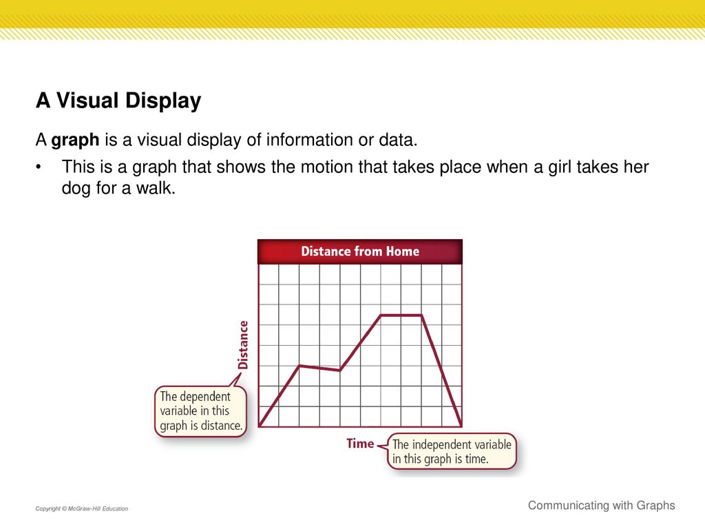
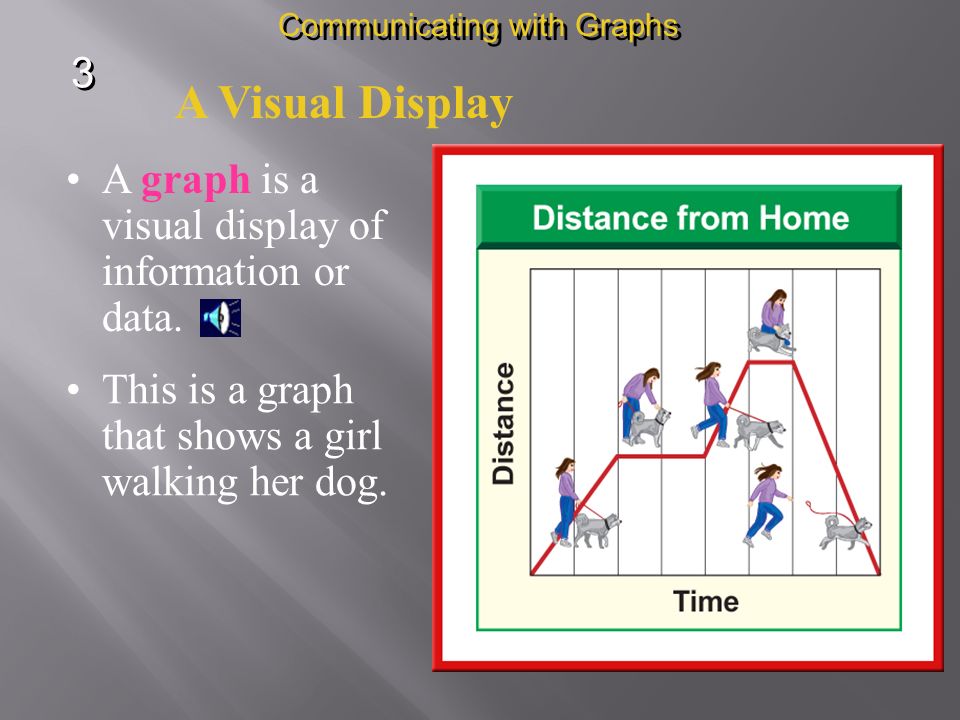
As the world becomes increasingly data-driven, the need for effective communication of complex information is more important than ever. Enter visual displays of information or data, a communication strategy that presents data in a graphical format for easier comprehension. From bar charts to infographics, visual displays have become a popular tool for conveying information in a clear and concise manner.
The power of visual displays lies in their ability to transform data into a visual story, making it easier for audiences to digest and understand information. By leveraging the visual cortex in the brain, which processes images faster than text, visual displays can convey complex data in a way that is both engaging and memorable. In this article, we will explore the benefits of visual displays of data and why they are becoming an essential tool for professionals in a range of industries.
What is a Visual Display of Information or Data?
A visual display of information or data is a way of representing information or data in a graphical or pictorial format. It is used to represent data in a way that is easy to understand and interpret. Visual displays can be used to present a variety of data from simple charts and graphs to complex visualizations. Visual displays can help people quickly identify patterns and trends in data, identify correlations between different data sets, and make decisions based on the information presented.
Types of Visual Displays
There are several types of visual displays that can be used to present information or data. Charts and graphs are the most common types of visual displays, and they are used to represent numerical data in an easy-to-understand format. Bar charts, line charts, and pie charts are the most commonly used charts and graphs. Other types of visual displays include maps, flow charts, timelines, and treemaps. Each type of visual display has its own advantages and disadvantages, and it is important to choose the right type of visual display for the data that needs to be presented.
Bar Charts
Bar charts are a type of chart used to represent data in a graphical format. They are used to represent data in a way that is simple and easy to understand. Bar charts are used to compare different values of data, or to compare different categories of data. Bar charts are generally used to represent numerical or categorical data, such as the total number of sales or the percentage of people who have a certain disease. Bar charts are a great way to quickly identify patterns and trends in data.
Bar charts can be used to compare different categories of data, such as the number of people who have a particular disease in different age groups. They can also be used to compare different values of data, such as the total number of sales in different countries. Bar charts can also be used to compare different values of data over time, such as the total number of sales in a certain month or year.
Line Charts
Line charts are a type of chart used to represent data in a graphical format. They are used to represent data in a way that is simple and easy to understand. Line charts are used to represent numerical or categorical data, such as the total number of sales or the percentage of people who have a certain disease. Line charts are used to compare different values of data, or to compare different categories of data. Line charts are a great way to quickly identify patterns and trends in data.
Line charts can be used to compare different categories of data, such as the number of people who have a particular disease in different age groups. They can also be used to compare different values of data, such as the total number of sales in different countries. Line charts are also used to compare different values of data over time, such as the total number of sales in a certain month or year. Line charts can also be used to identify correlations between different data sets.
Frequently Asked Questions
A visual display of information or data is a visual representation of information or data, typically presented in a graph, chart, or diagram format. This type of display can be used to make complex data more accessible and easier to understand.
What is a visual display of information or data?
A visual display of information or data is a way of presenting data or information in a graph, chart, or diagram format. This type of display is used to make complex information easier to understand and more accessible to a wider audience. By using various colors, shapes, and lines, a visual display can be used to show relationships between different pieces of data or to illustrate trends.
What are some common types of visual displays?
The most common types of visual displays include bar graphs, line graphs, scatter plots, pie charts, and heat maps. Bar graphs are used to compare different values or show changes over time. Line graphs are ideal for showing trends or changes in values over time. Scatter plots are used to show relationships between two variables. Pie charts are used to compare parts of a whole. Finally, heat maps are used to visualize the magnitude of a value across a geographic area.
What are the advantages of a visual display?
The main advantage of a visual display is that it can be used to make complex data more accessible and easier to understand. By using colors, shapes, and lines, a visual display can quickly illustrate relationships between different pieces of data or show trends. Additionally, visual displays can be used to quickly convey information in a more engaging and memorable way.
What are the disadvantages of a visual display?
The main disadvantage of a visual display is that it can be misleading if not used correctly. For example, if a visual display is too crowded or contains too much information, it can be difficult to interpret. Additionally, visual displays can be used to manipulate data to make it appear more favorable. It is important to use visual displays responsibly and to be aware of any potential biases.
How can I create a visual display of information or data?
Creating a visual display of information or data can be done using various software programs, such as Microsoft Excel, Google Sheets, or Tableau. These programs allow you to enter data, select a visual display type, and customize the display to fit your needs. Additionally, many online tools are available to help create visual displays quickly and easily.
In conclusion, a visual display of information or data is a powerful tool that can help individuals and organizations to communicate complex ideas in a simple and effective manner. With the rise of technology, we have access to a wide range of visual aids that can be used to create impressive displays of information. From graphs and charts to infographics and videos, the possibilities are endless.
However, it is important to remember that not all visual displays are created equal. A poorly designed chart or infographic can be just as confusing as a wall of text. As such, it is crucial for individuals and organizations to place a premium on creating high-quality visual displays that are easy to understand and interpret. By doing so, we can unlock the full potential of visual communication and drive meaningful change across a wide range of industries and sectors.